Le Miroir de Brume
The name of the association means the mirror of mist.
Le Miroir de Brume is a nonprofit organisation that was born in June 2018 from the passion of two friends for esotericism. Their aims are to promote esotericism in Switzerland and in France, to gather people with the same interests and organise events in the future.
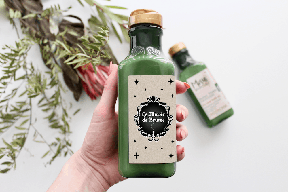
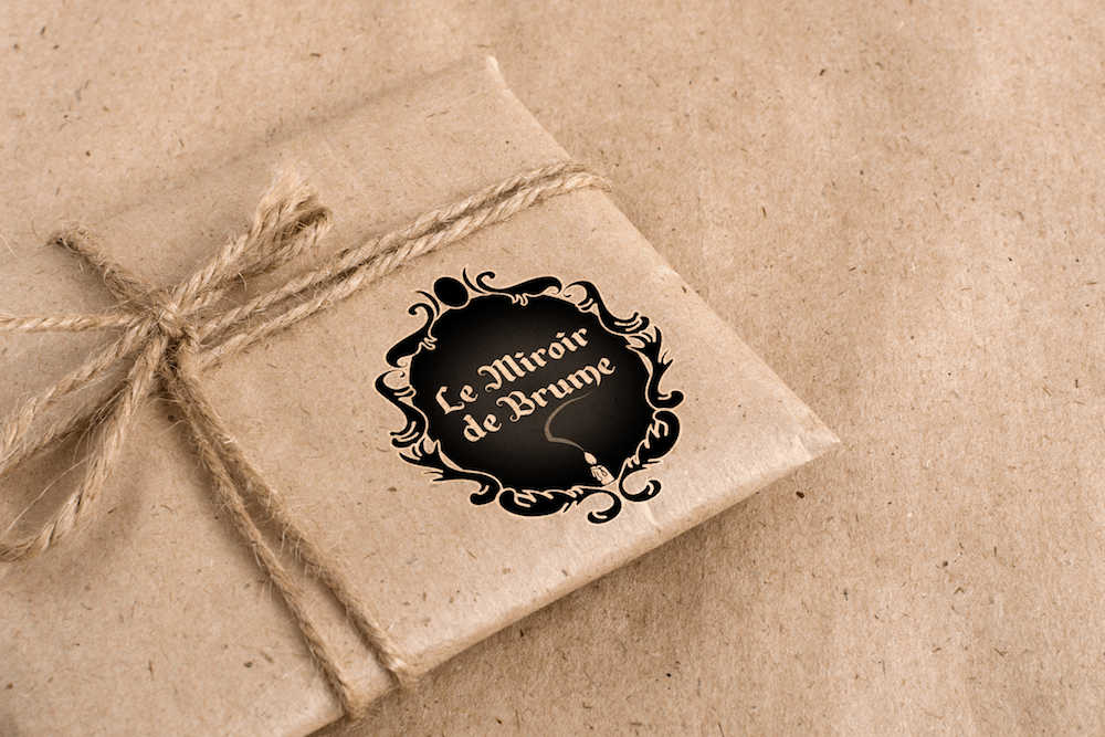
They contacted me because they needed a logo and a visual identity for their association. They already knew that they wanted a Victorian mirror as the main element of their logo to which I added some magical elements, such as the candle and the triple moon. I also incorporated a centric gradient in the center of the mirror to create a mist effect.
The font, Alpengeist JF, literally means “Spirit of the Alps” in German. Based on a hand-lettered sign, this typeface has a Blackletter style coupled with a whimsical feel, which represents perfectly the association.
The colour palette is inspired by misty days and full moon nights.

Brand Applications: